School Signage to Boost Your Signal
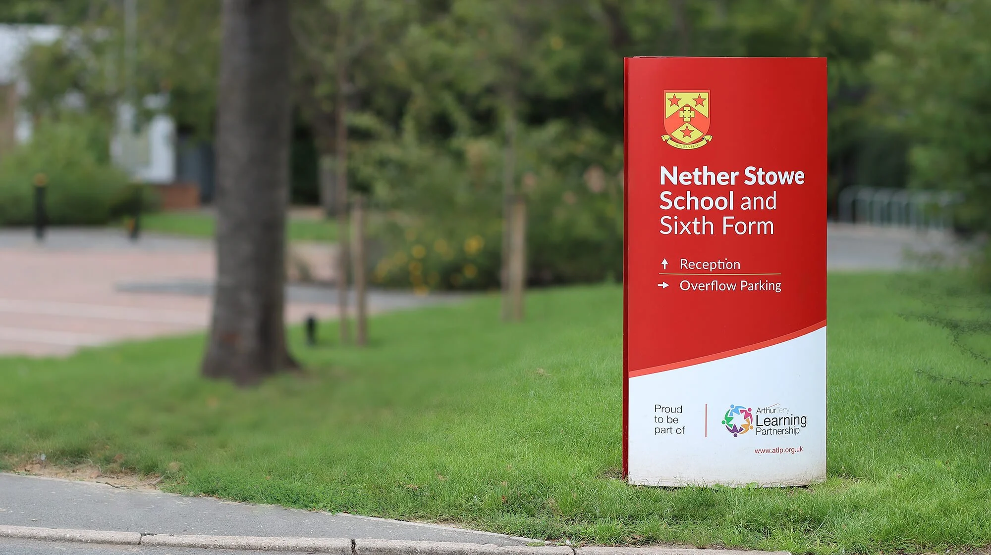
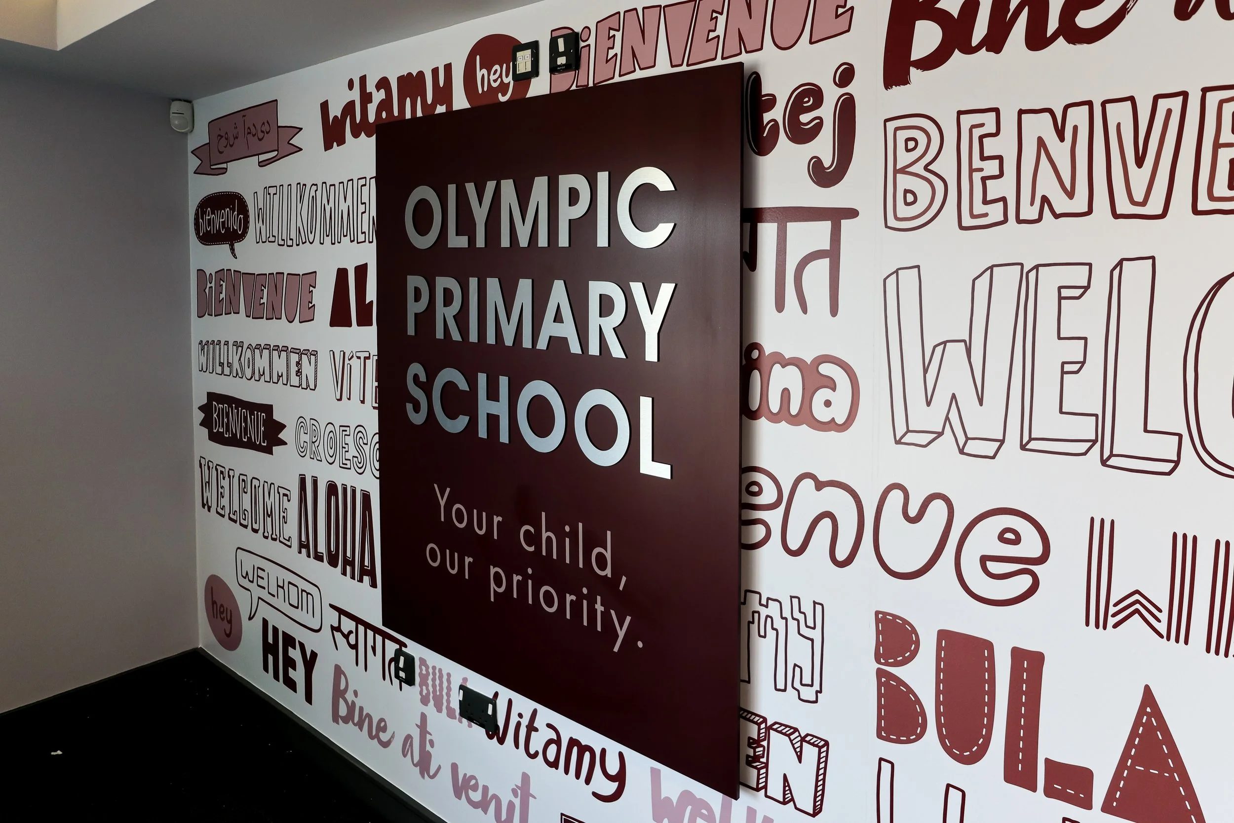
External signage must be attractive and engaging for a first impression to last. Your signage must strike the right balance between practicality and visuals as the first point of contact for customers or visitors.
Your signage should accurately reflect your brand identity, communicate with your target audience, and provide a practical purpose, such as informing, directing, or inspiring.
Your point of difference.
Strong, sleek and well-maintained signage can improve the visitor experience while leaving a lasting impression, but clear, concise messaging is crucial to success.
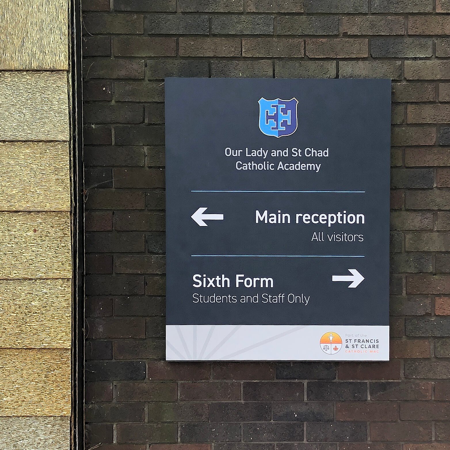
It is essential to carefully consider the primary purpose of your signage – are you aiming to promote your institute, share information, or direct your staff, learners and their families?
In some cases, this will be the first interaction between students and the institute; therefore, signage needs to be accessible and easy to read and understand; otherwise, it can lead to mixed or negative messages.
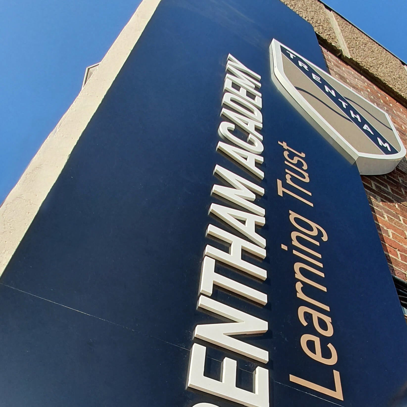
Above: Trentham Academy before and after. The signs have been carefully designed to create a more cohesive approach for visitors and are hiding unsightly pipework.
Not only should the visuals be appropriate for the purpose, but the signage should be well maintained.
Faded or damaged displays suggest the products or services provided by the company can project an image of lack of consideration. At the same time, unclear directions can make visitors feel lost, quite literally! Conversely, the absence of signage can be just as damaging.
Put yourself out there.
For any educational establishment, trust and reputation are valuable assets. Effective signage assists in promoting the institute's values and ethos.
Signs can be an effective way to display a school's achievements, for example, excellent Ofsted scores.
Displaying this information can help parents and students feel like they are in capable, trusted and reputable hands.
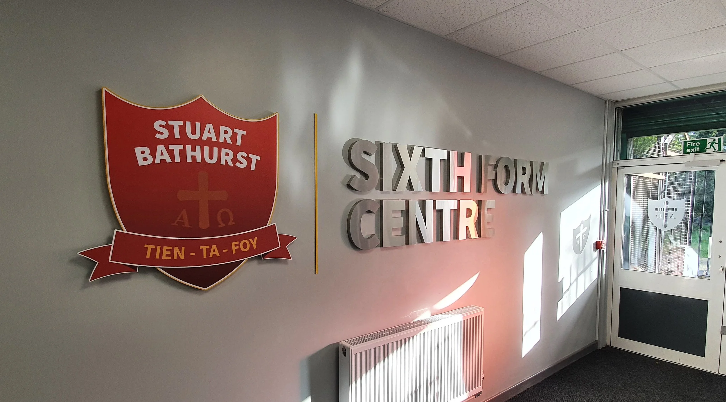
Signage is also a powerful tool to convey information about the heritage of the school – like when the school was founded when a particular building was built or any other point of historical interest.
Building a reputation with signage
Building trust involves choosing the best wording to include in your signage. So, in addition to your messaging, it's imperative to consider how you say it.
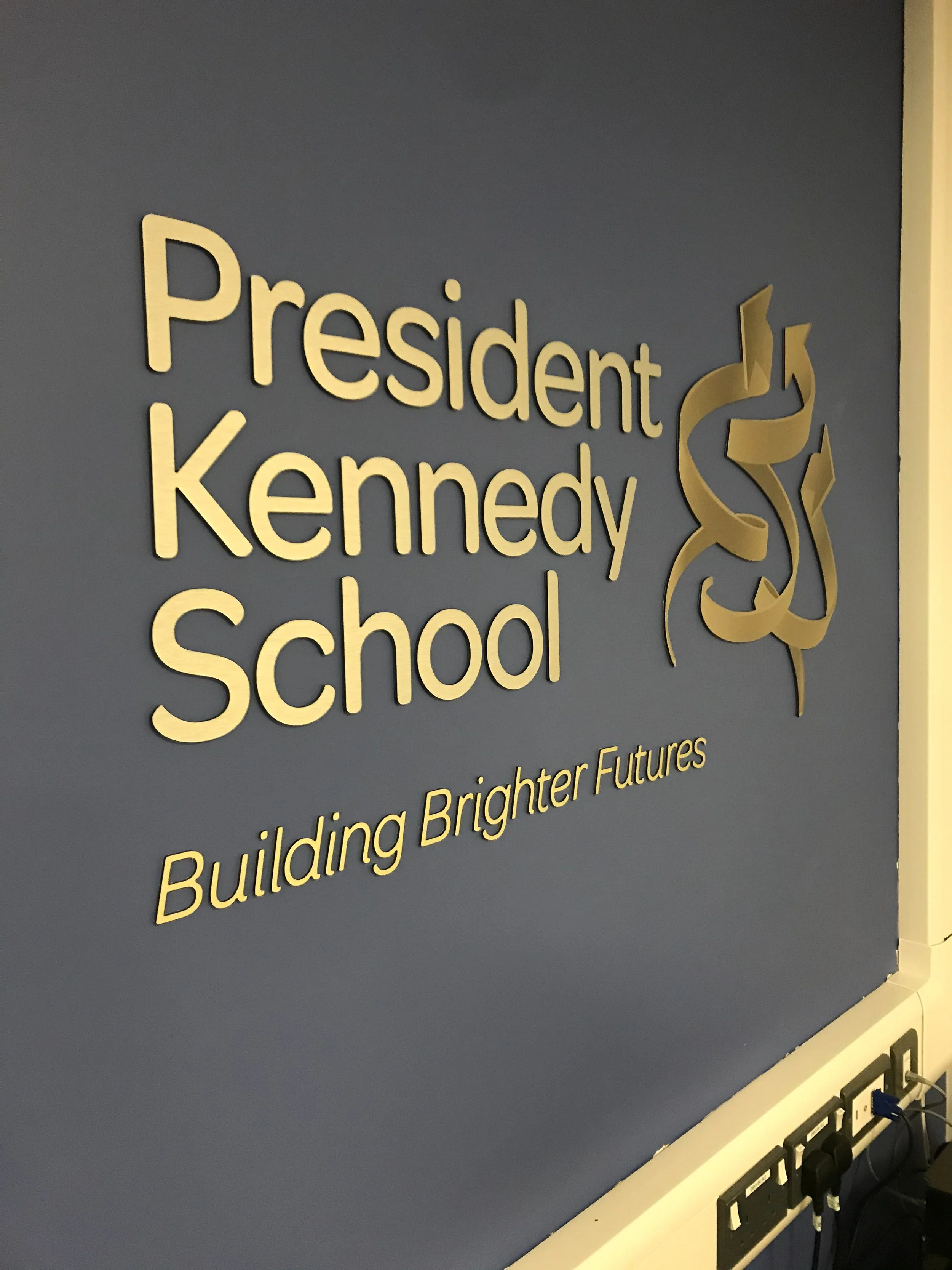
In visual design, font selection, colour choice, and layout can all contribute to the perceived reputation of the institution.
Serif fonts (such as Times New Roman or Georgia) are often used in conveying tradition, heritage and old-school reputation; therefore are well suited to any school with a long history.
On the other hand, sans-serif fonts (such as Arial or Verdana ) often imply modernity and progressiveness.
When selecting colour, we may want to introduce colours that invoke feelings associated with your school values. These are most commonly blues, greens and greys.
This is your sign.
Overall, signage is a significant investment for any school, university or other educational institution. It can aid student safety, influence the perceived reputation of the school in the public eye, and even help and inspire pupils to do their best work.
We would love to hear from you and see what we can do to help you boost your signal.
Using the link below, book your complimentary, obligation-free consultation where we will go over your needs and discuss how we can best address them to maximise your institute’s potential.

