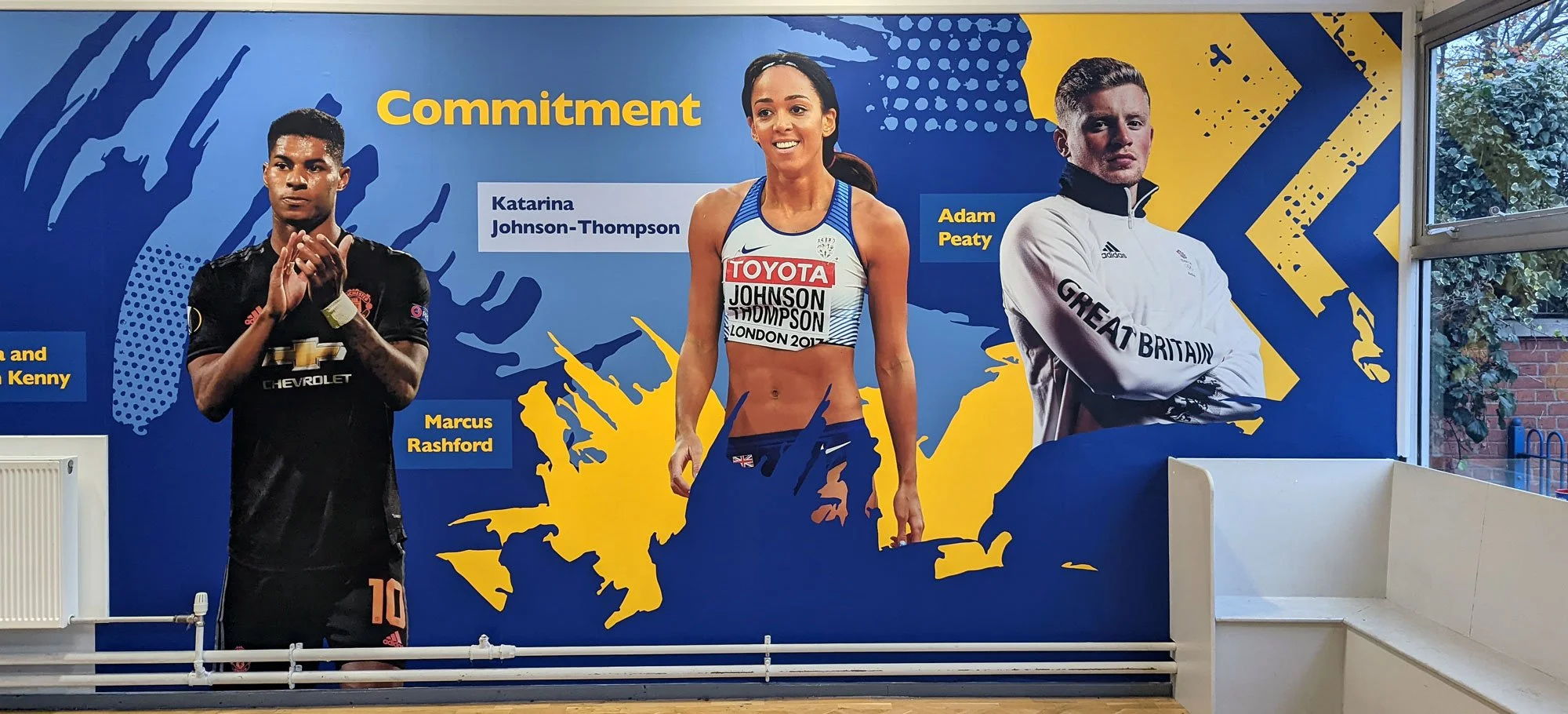
We value sport at Chivenor School.
When we were asked by Chivenor School to improve the look of their sports hall we weren’t sure what to do at first. The space was large but it was also very disjointed, with multiple levels, a myriad of obstructions and no clear focal point apart from the large tension graphic that needed to remain where it was. The headteacher wanted a design that celebrated a diverse group of sporting personalities and was also keen to include their values messaging .
Before - the hall is a series of disparate areas
Our early concept idea.
Our early ideas were based on designing a series of wallboards that could fill the different spaces in an asymmetric grid. The school were happy with the idea. The problem was that on reflection, we weren’t. It needed a rethink so we called the design team together and started again with a blank slate.
By incorporating the tension graphic into the main design and switching to a mix of wallpaper, boards and dimensional wall displays we created a new, more cohesive concept that did a much better job of creating the impact that the headteacher was after.
The large tension graphic seamlessly fits into the new design.
The design flows from one area to the other.
“It’s made such a difference, we love it. Now I need to talk to you about our other hall...”
The end result was well worth the extra effort, with a design that flows naturally across the spaces, weaving the school values into the room. As happy as we are, more importantly, the pupils and staff are loving the impact that these wall graphics have made, with one person remarking “We’ve finally got a sports hall!”.


