What do you need to know about window graphics? 6 top tips for you.

Do you have lots of windows in your school that you want to put to better use?
Don’t know where to start or what is involved?
As designers and makers of window graphics, we’ve helped schools and colleges all over the UK to decide the best window treatments based on cost, design and performance over time. This article shares some tips for you to consider before you start your window manifestation project.
Why can window graphics be so hit and miss?
One of the reasons that deciding what to do with your windows can be problematic is that unlike creating a display on a wall, anything that gets applied to a window needs to consider how the light will affect it, and how it will look from both sides. It gets harder to visualise the result when you consider that the light will change throughout the day and the year. On top of that, anything applied to your window will affect its primary two functions: to let in light and allow you to see from one space to another.
Here we are talking about graphic treatments rather than specialist tints and films.
1. Be clear about what you need to achieve with your window manifestation
This might sound obvious, but it will help you decide the best application if you can work out exactly what success looks like for your window graphics. Common objectives are:
to create more privacy
to create impact
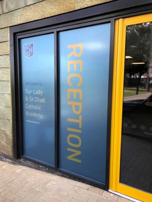
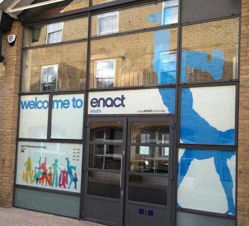
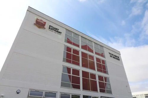
to provide information
to hide an unsightly view
to change the appearance
You may need to meet more than one objective with your window graphics but it will be helpful to understand which is the top priority if you later have to compromise because of other criteria (materials, design, lighting etc)
2. Your canvas might be larger than you think
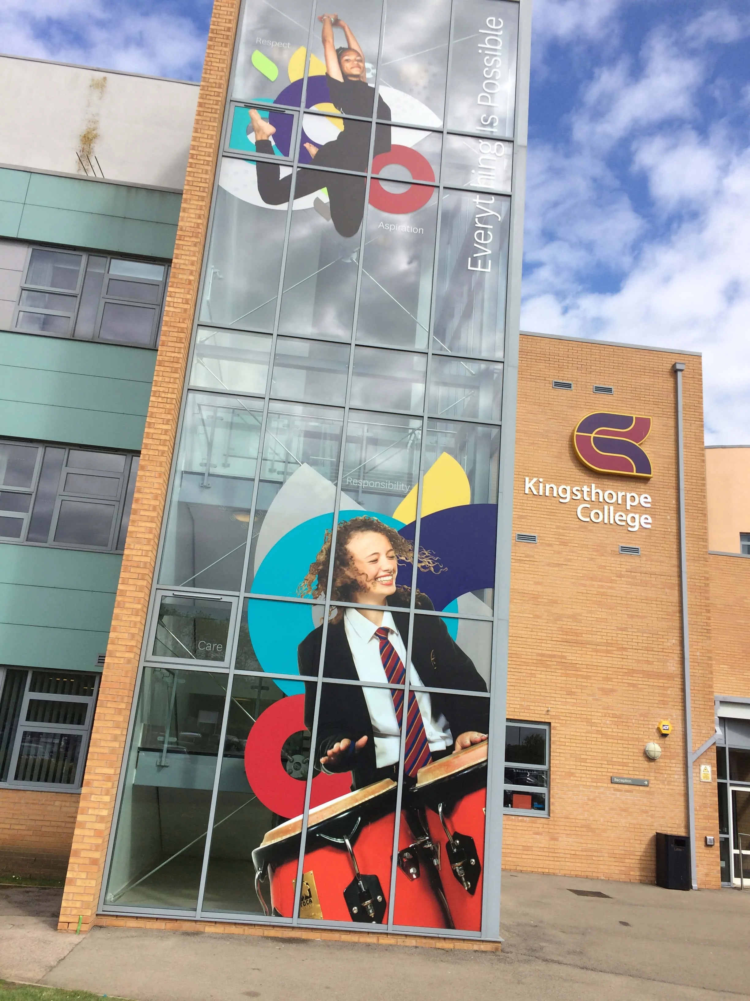
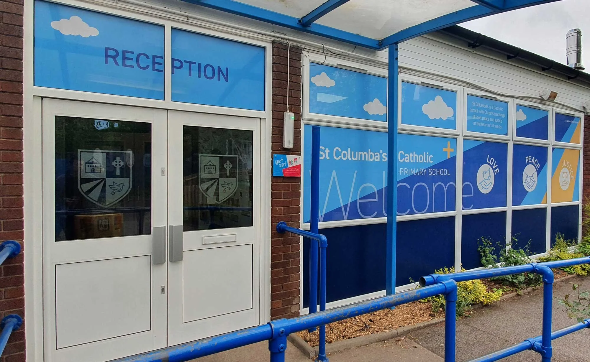
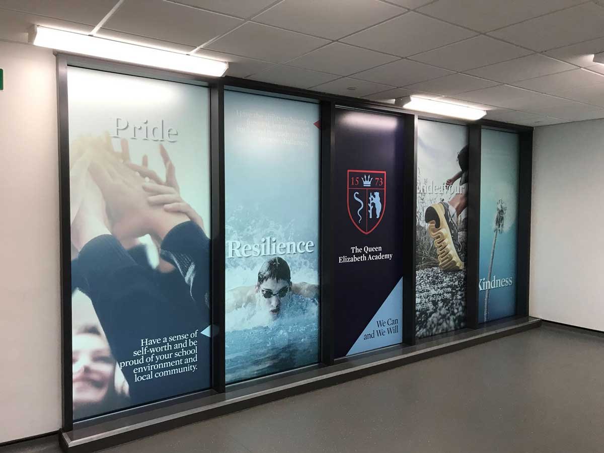
Windows create an excellent opportunity to add impact, but you don’t need to be restricted by the individual window or door panes. Looking at your windows differently can often reveal new options for you to get your message across. Vinyl window graphics can be designed to work around window frames to fill larger areas and increase the impact of your design and per m2 can be significantly cheaper than other options to get the same visibility. With windows, you can think as big as you want to.
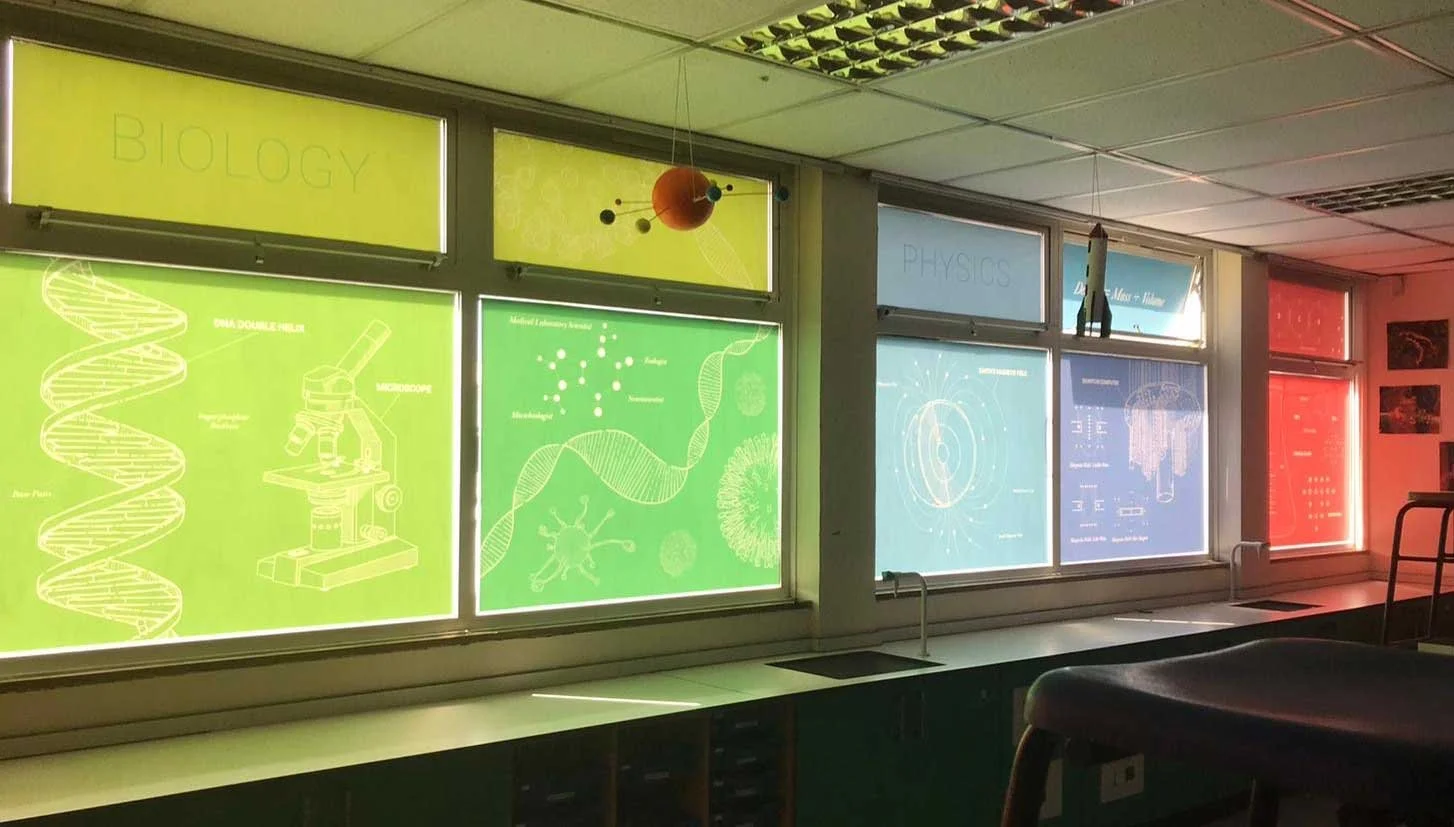
3. Consider where the light comes in from
It is easy to spend a lot of time creating a beautiful design that looks either washed out or dull and lifeless because of the amount of light shining through your design. If you have a very strong light source behind your graphic, then your design will need to be much bolder. Conversely, if the lighter side is being viewed from the front, consider adding more high contrast areas and avoiding darker backgrounds to stop the design from disappearing into the shadows.

4. Think about how much of your window you may need to cover
The actual coverage of your window might look very different depending on your objective. At this stage weigh how much of your window to cover carefully against any potential loss of light or vision. For example, if your primary goal is to create partial privacy, you can consider creating a design that uses a horizontal band of etch vinyl, which would allow you to achieve your goal without losing more light than you have to. Or you might consider strategically applying shaped graphics to obscure vision from certain viewpoints.
5. Choose the material that works best for your needs
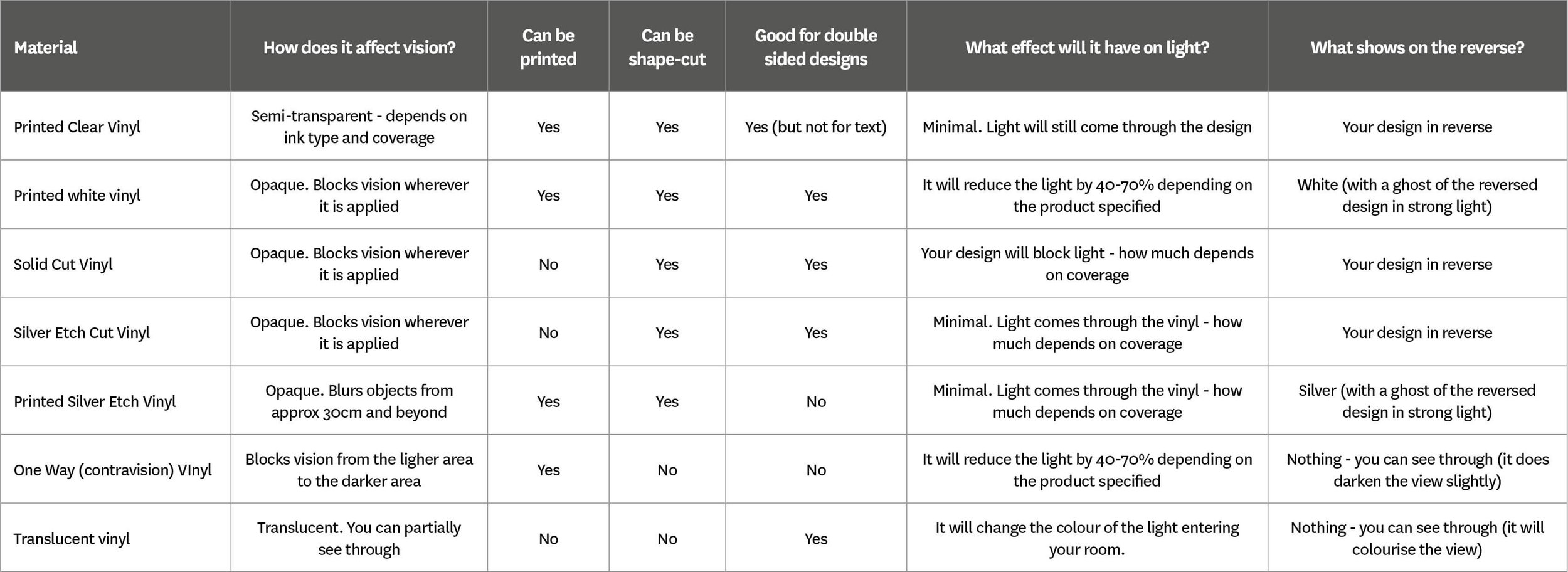
There are hundreds of different materials on the market that can be applied to windows, each performing a different task. Some of these can be printed on and others, like window tints cannot. Some window films or vinyl products are also designed to be applied to either the inside or outside only (e.g. reflective or solar films or one-way vinyl). Check with your supplier what products they use will best match your goals and what restrictions or side-effects they might bring. For example, using one-way vinyl would be perfect to create a high impact design on the outside of your windows that still allows you to see through when inside, however you cannot create a double-sided effect and the product has a shorter lifespan than other products. Standard options for windows include:

Printed clear vinyl window graphics
Printing your design on clear vinyl (or optically clear vinyl if you need better clarity) will immediately create a double-sided effect when you apply it to your window. Just remember that when in-situ the design will need to work with the light levels from both sides and the design may look ‘washed out’ in very light or very dark conditions. If you need white areas, then check with your supplier that they can print white ink, as not all print companies offer this. Abstract designs that work well when viewed in reverse will work better on clear vinyl.

Solid shape-cut vinyl window graphics
You can create very effective designs by applying solid, coloured vinyl text or graphics to your windows. Using opaque vinyl to create your design will look more consistent in all light levels than clear vinyl. You will not see through any part of the window that you apply the vinyl to, and it will block some light. Also, note that cut vinyl is much easier to pick off than other solutions so think carefully about its suitability in your school environment.

Etch vinyl window graphics
Silver (other tints are also available) etch is a common window treatment. As the name suggests, it creates an effect similar to the much more expensive acid etching or sandblasting processes. Etch vinyl will allow light through (check with your supplier how much as this varies from product to product) but is completely opaque so is excellent for creating privacy.
Translucent window vinyl
In areas where you have a strong light source, you can use coloured vinyl to create coloured filters or stained-glass effects. These are usually thinner and allow more light and some vision through them (imagine looking through a coloured glass bottle). A wide choice of colours and finishes are available.

Full colour printed white vinyl graphics
If you want your design to look solid then printed white vinyl will deliver this. This can be made double-sided by combining one print on white vinyl and another on clear (printed in reverse). The effect is a high opacity full-colour design, so if you need to create a punchy, full-colour image, this could be the right solution. If you stick to a single-sided design then the reverse will look plain white. You will block light and obscure vision anywhere that you apply white vinyl.
One way vision window graphics
This specially designed product combines a dark coloured adhesive with tiny holes in the vinyl to allow vision from the darker area to the light area. Great for creating privacy for office spaces where you still need to see outside. Because it is perforated, it’s best not to add small details to your designs.
6. Check your expectations
If you want to see your design on both sides of the window, then remember that all the usual rules of physics still apply! If you find yourself making any of the following requests, then you may need to rethink and better define your objective:
We need the design to be double-sided AND we want to be able to see through from ONLY one side.
We don’t want people to be able to see IN, but we still need to see out BUT we want punchy graphics on the inside.
We want full-colour graphics everywhere BUT we don’t want to lose any light.
We need the text to be read the same from both sides AND we still need to see through.
It’s always worth ordering a sample to test the desired result if you want to do something a little more complex.
Still not sure what window graphics you need?
Use our contact channels to ask us a question or book a chat.