Art History is Given a Modern Design
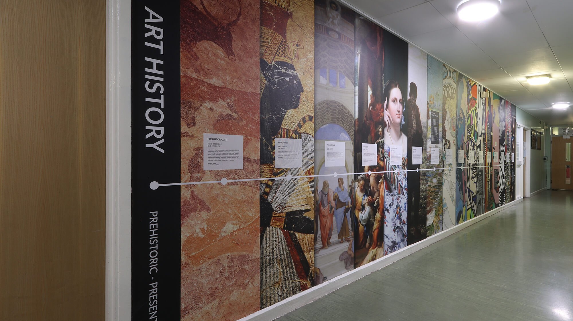
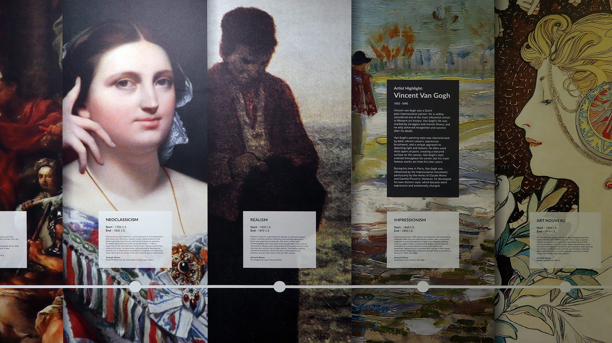
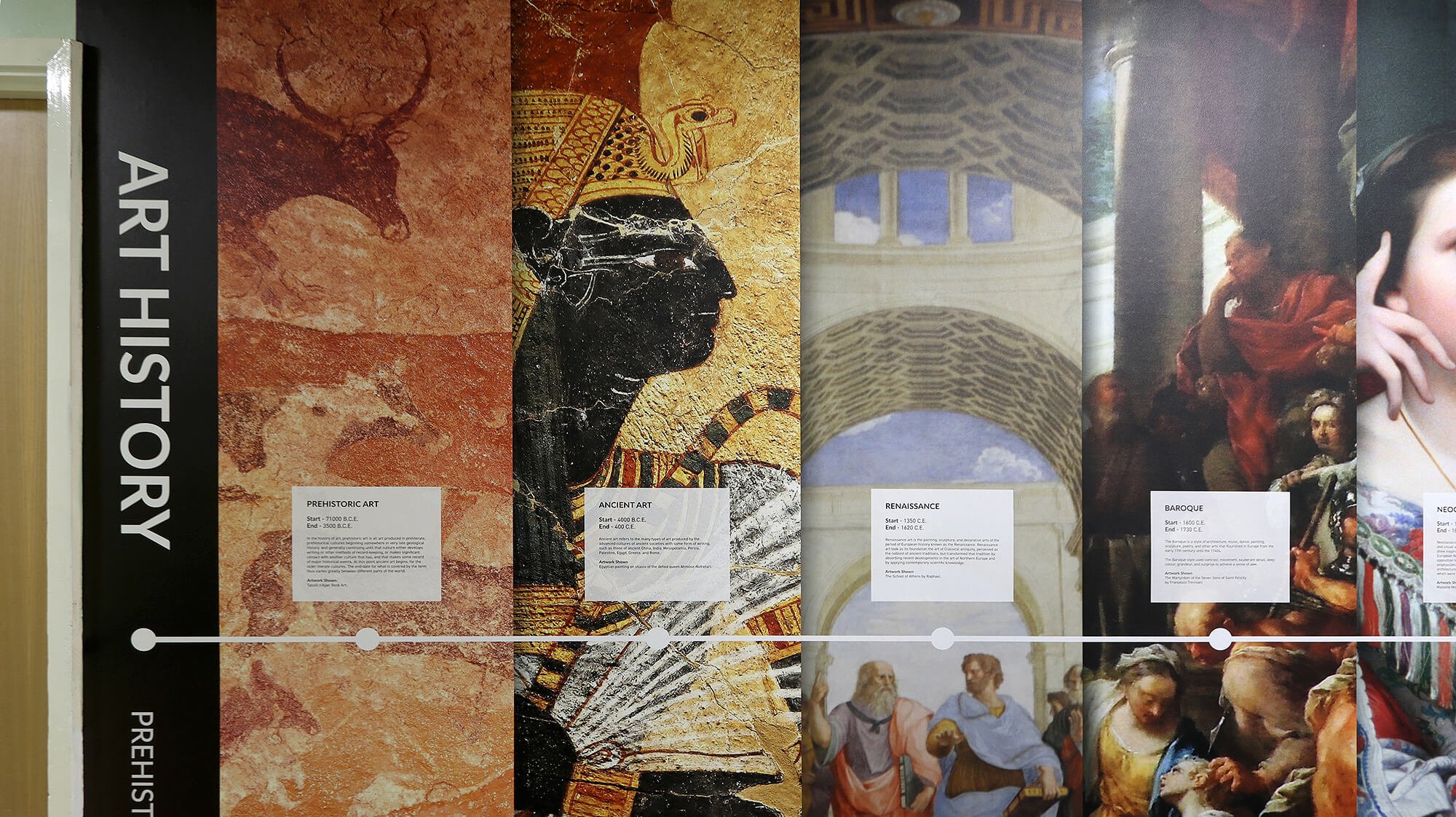
We’re always excited to see any investment in creative subjects, so we were especially delighted to be asked to design and install a giant History of Art mural for Nether Stowe School as part of their latest set of interior graphics.
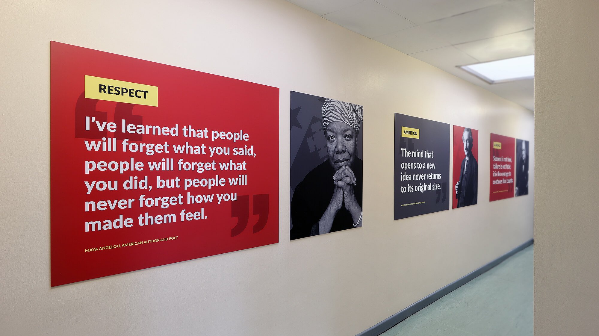
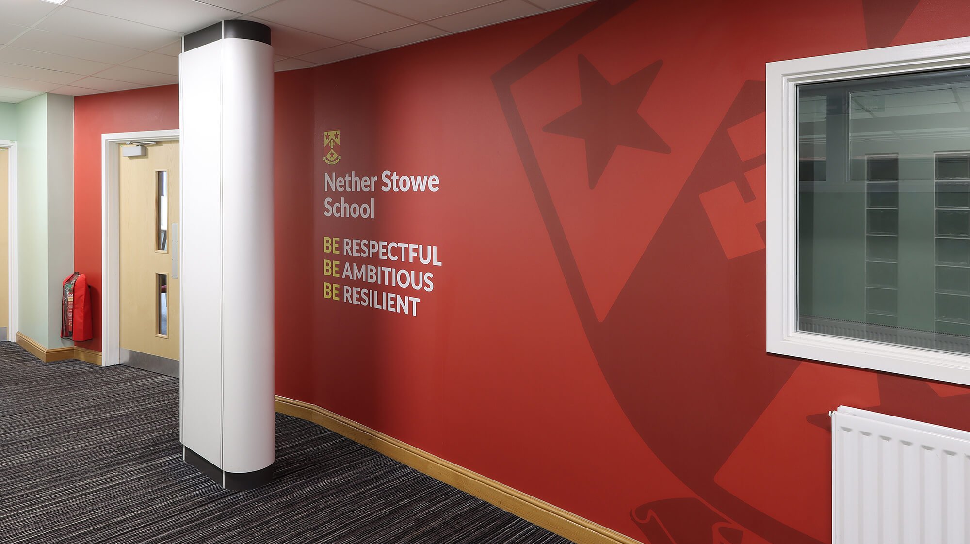
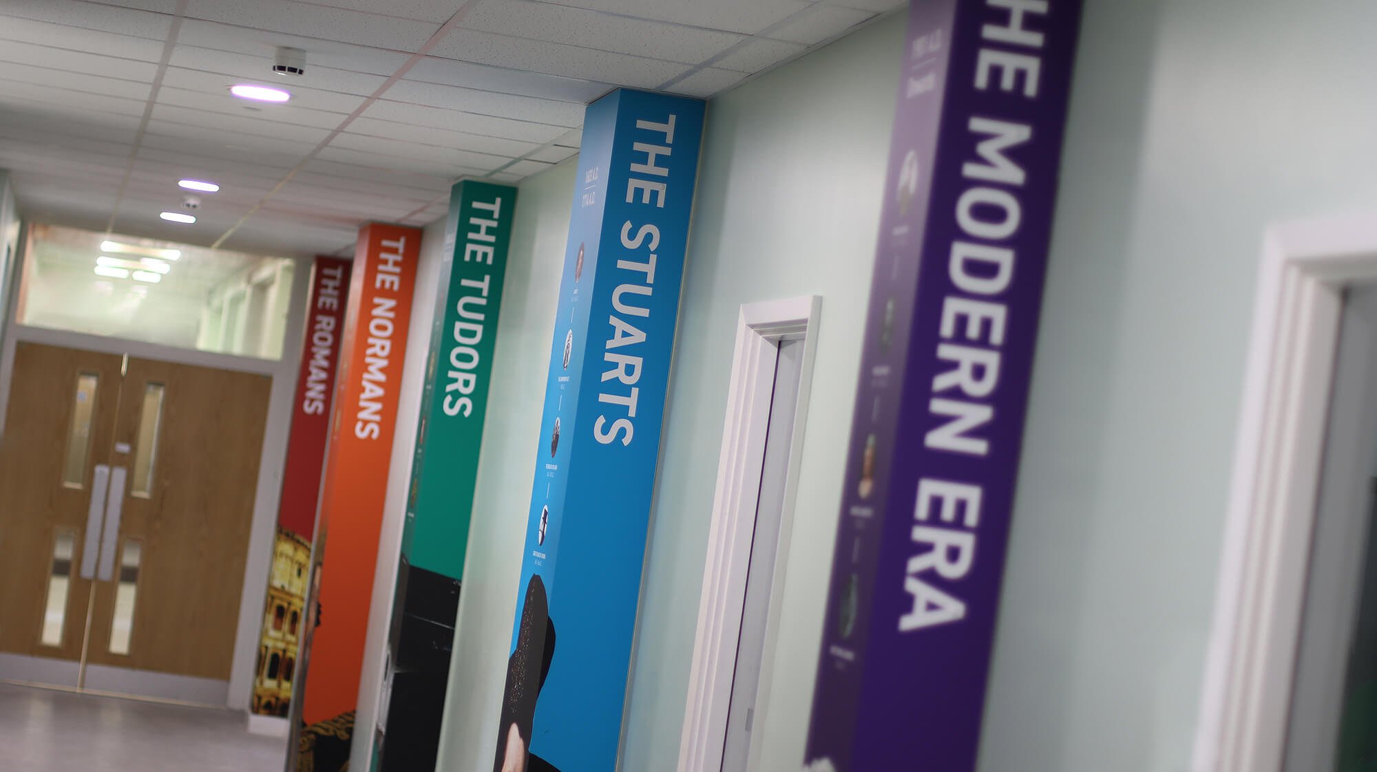
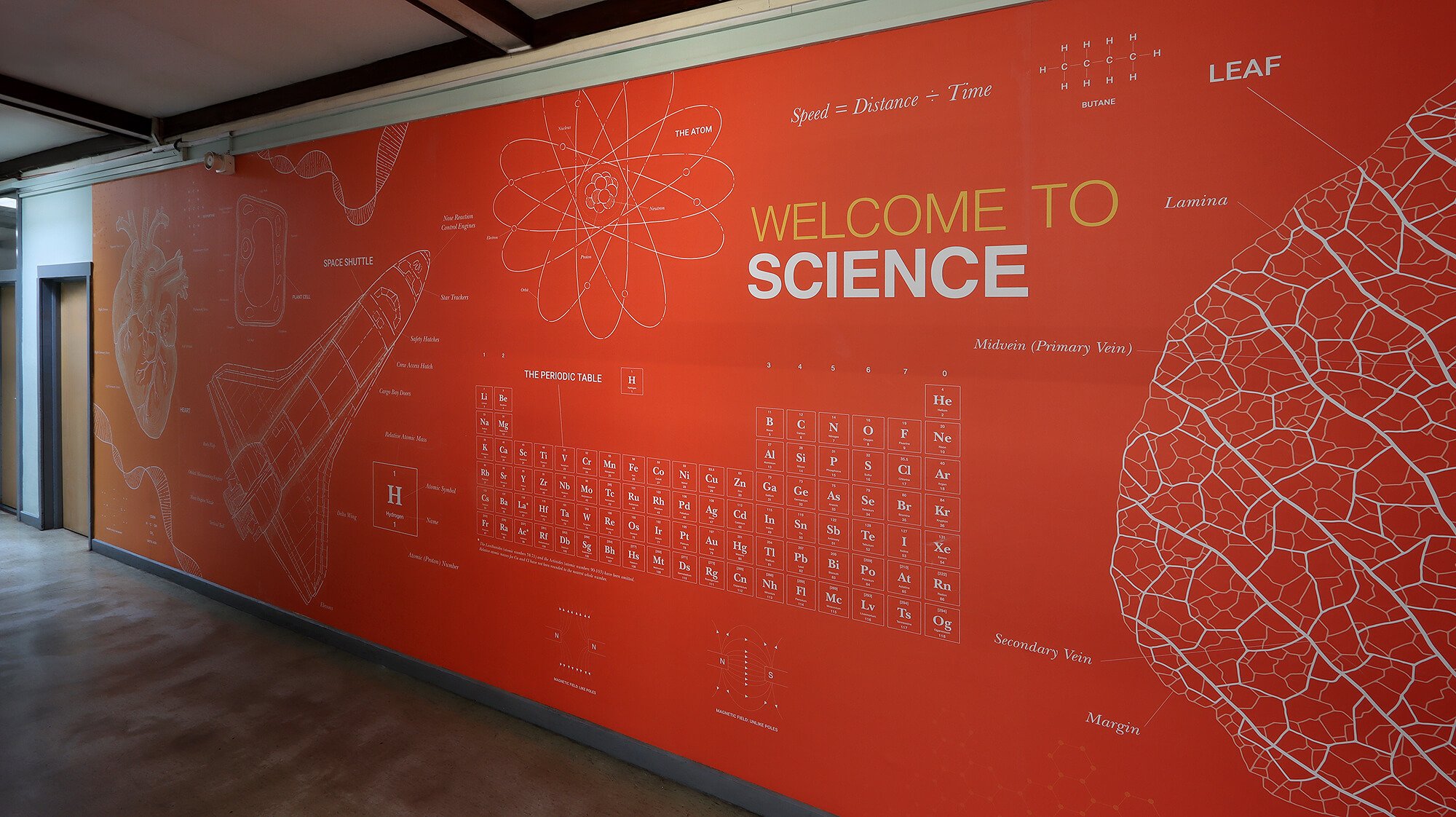
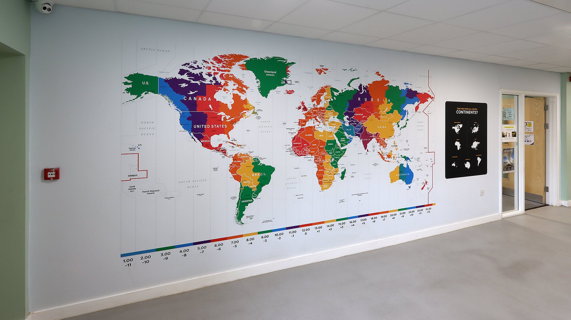
We also worked with the school to identify a range of spaces that could be used to communicate core values. The designs for these built on the school branding and the result was a suite of displays that perfectly blend clean, contemporary layouts with historic imagery and clear messaging.
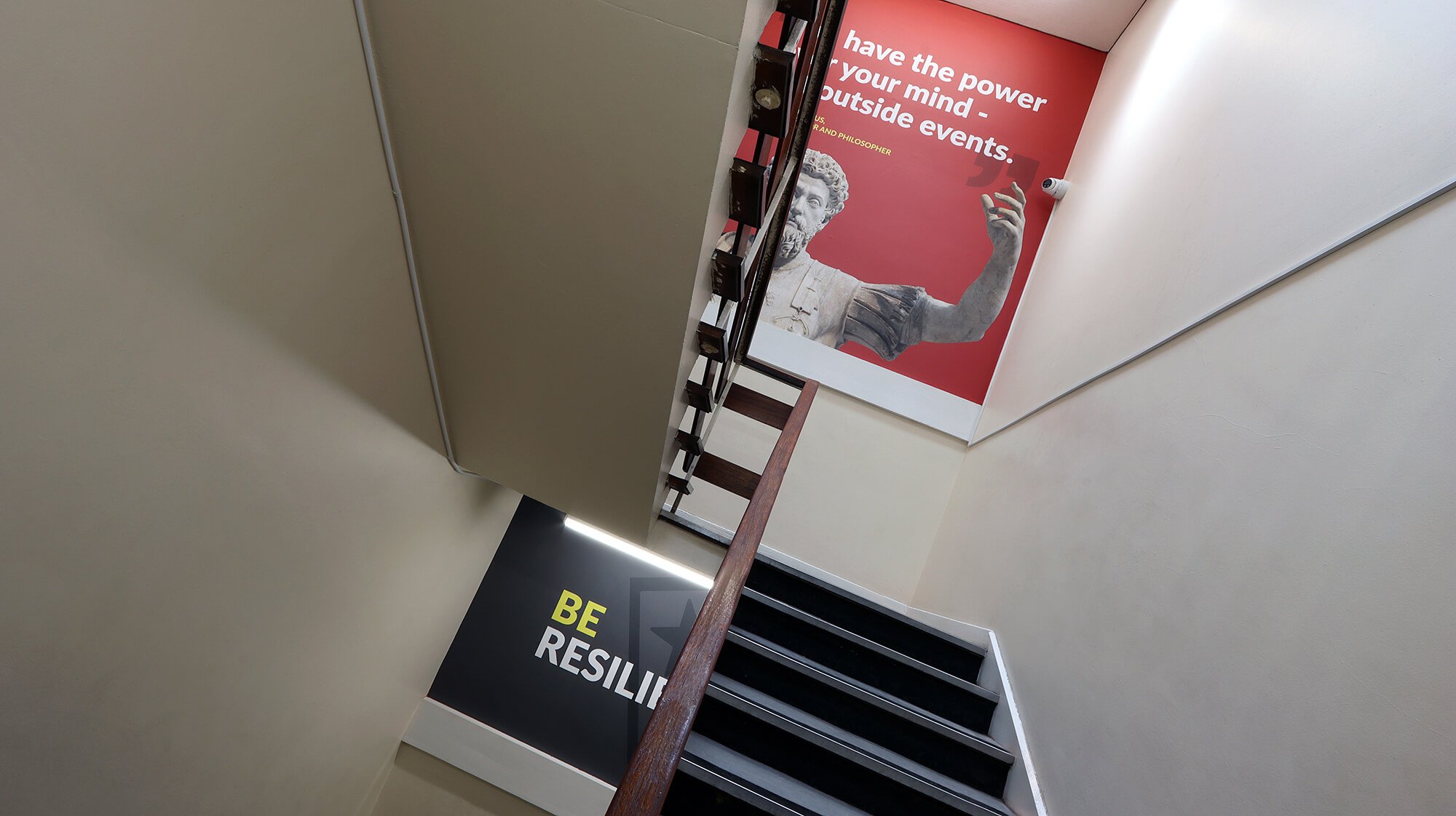
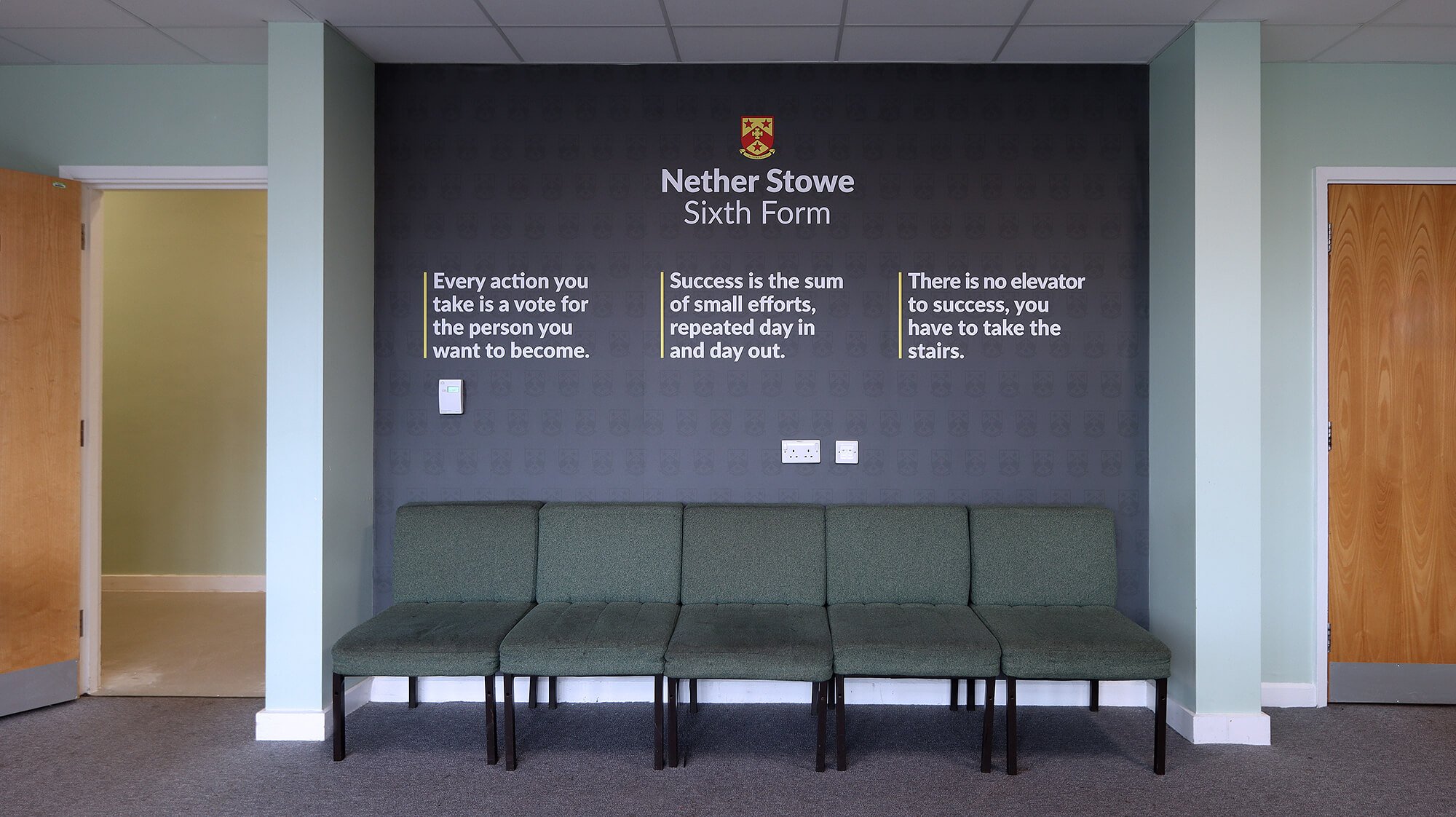
Each of the three staircases we designed to tell a min values story as you go up or down, with a split design that is simple but highly effective. The Sixth Form area received similar attention. Outside we stuck to the bold red as the prominent colour, and inside, we used a grey design to contrast with a simple but sophisticated quote wall.
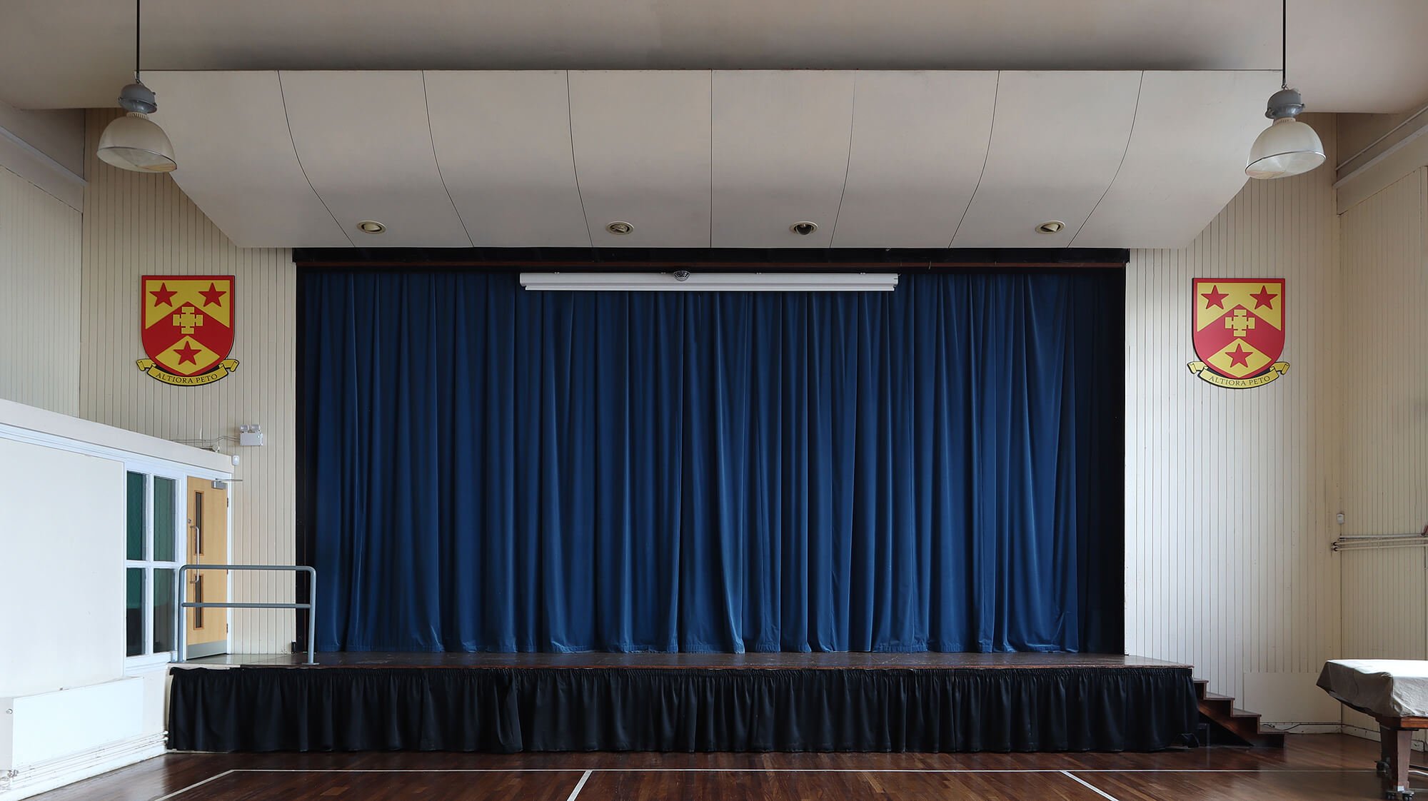
In the main school hall we designed and installed large hanging banners for the back wall, perfectly sized to command attention without overpowering the space, while at the font we installed a pair of layered, flat-cut school shields to create some brand presence.
“We’re really happy with how this came out. It all flows really nicely and the designs look so punchy.”


